Case Study Note: This case study is a work-in-progress and may include incomplete sections. Contextual imagery will soon be incorporated to enhance the narrative and better illustrate the project’s craftsmanship.
Summary
Problem
The Realtor.com platform was struggling with outdated interfaces and functionality that hindered user engagement and failed to meet modern real estate market demands.
Solution
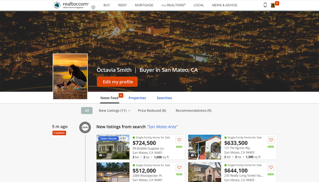
Undertook a comprehensive redesign of the platform, focusing on enhancing usability, modernizing the user interface, and integrating innovative features like real-time property updates and personalized search filters.
Impact
The redesign significantly boosted user engagement and satisfaction, solidified Realtor.com’s market position against major competitors, and led to notable improvements in operational efficiency and brand perception.
Project Foundations
Overview
Realtor.com, under the umbrella of Move, Inc., faced a critical juncture, needing a strategic overhaul to reposition itself competitively in the dynamic real estate market. This transformation was not just about a visual redesign but rethinking the entire user experience to align with evolving consumer expectations and technology standards. The initiative involved a comprehensive rebranding and UX/UI redesign, aiming to make Realtor.com the go-to platform for real estate professionals and consumers alike.
Objectives
The primary goal was to elevate Realtor.com from a functional to an indispensable resource, enhancing user engagement and satisfaction. Objectives included improving the property search process, streamlining user flows, and integrating new, innovative features to support both end-users and real estate professionals. This strategy was geared towards increasing market share, user base growth, and ensuring a seamless, intuitive experience that reflected modern user habits and preferences.
Team and Stakeholders
The project was spearheaded by a diverse team of experts, including UX/UI designers, product managers, developers, and marketing professionals, all led by senior design leadership. Key stakeholders included Move’s senior management, who were instrumental in aligning the redesign with business goals and providing the necessary resources. Collaboration extended to external stakeholders, including real estate professionals and end-users, who were involved through continuous feedback loops to ensure the platform met varied needs effectively.
Challenges & Barriers
Problem Statement
Realtor.com was grappling with an outdated user experience and scattered functionalities that impeded user satisfaction and engagement. The site suffered from a lack of intuitive navigation and modern, user-friendly features, which made it difficult for users to find and interact with real estate listings effectively. This resulted in reduced traffic and lower conversion rates compared to competitors.
Complexity
The redesign required a delicate balance of innovative technology integration and legacy system upgrades. The complexity was heightened by the need to consolidate vast amounts of real estate data into a cohesive, easy-to-navigate interface that could support both novice users and seasoned real estate professionals. Additionally, integrating real-time data feeds and ensuring the platform’s scalability to handle increasing user demands added layers of technical and strategic complexity.
Risks
Significant risks included potential disruption to ongoing service during the transition, alienating existing users accustomed to the old interface, and the high stakes of rebranding which could potentially dilute the established brand identity. There was also the risk of underestimating the competitive response, especially from agile competitors who were rapidly enhancing their digital offerings.
Market Dynamics
Customers
- Homebuyers, sellers, and real estate professionals: Realtor.com served a diverse user base, from first-time homebuyers looking for ease of use, to seasoned real estate professionals requiring advanced features. Each of these groups had different needs in terms of functionality, from basic property search to advanced filtering options and tools for managing listings.
- User pain points: Key challenges included difficulty navigating the site, inefficient search functions, and outdated property information, which frustrated users and decreased engagement.
- Expectations: Customers were increasingly expecting real-time data, mobile-friendly features, and a seamless user experience, especially as competing platforms were improving in these areas.
Company
- Internal dynamics: Realtor.com was operating within a highly competitive market. The company aimed to differentiate itself by being a trusted, data-rich source for home listings, but struggled with an aging platform that couldn’t match the agility or modern features of competitors.
- Vision and leadership alignment: The company’s leadership recognized the need for a bold redesign to stay relevant in the market. As Senior Director of Design, I aligned our design vision with the broader business objectives to transform the platform into a market-leading, user-centered experience that prioritized both efficiency and ease of use.
Competitors
- Primary competitors: Realtor.com faced stiff competition from Zillow, Redfin, and Trulia, each offering more modern, intuitive platforms that were increasingly capturing market share. Zillow in particular had become synonymous with online real estate searches, raising the stakes for Realtor.com to innovate.
- Competitive differentiation: While competitors focused heavily on broad user experiences, Realtor.com sought to differentiate by leveraging its deep, trusted data sources and partnerships within the real estate industry. The challenge was to ensure that this data was presented in a way that was not only accessible but also provided more value than competitors’ offerings.
Strategic Leadership
Leadership Role
- Direction and Vision: As the Senior Director of Design, I spearheaded the strategic overhaul of Realtor.com’s digital presence. My role was crucial in steering the project’s direction, aligning the design strategy with the company’s ambition to reposition itself as a leader in the digital real estate space.
- Collaboration and Integration: I worked to bridge the gaps between design, technology, and business goals, ensuring that each element was integrated to create a cohesive, user-first platform. This involved negotiating and aligning different visions and expectations from various stakeholders to maintain a unified direction.
Key Decisions
- Platform Redesign: Opting for a complete redesign rather than incremental updates was a pivotal decision. This approach was chosen to make a significant market impact and address the foundational usability issues that were holding the platform back.
- Technology and Tools: We decided to implement cutting-edge technology, including AI for personalized property recommendations and advanced analytics to better understand user behavior and preferences. This was complemented by upgrading the backend infrastructure to improve site performance and scalability.
- Market Positioning: Another critical decision was to emphasize Realtor.com’s unique value proposition of providing real-time, accurate property data directly from MLS listings, setting it apart from competitors who relied on less timely data sources.
Team Impact
- Empowerment and Growth: The project became a catalyst for team development, as members were encouraged to take on new challenges and expand their skill sets. We fostered an environment that prioritized learning and innovation, allowing team members to experiment with new design methodologies and technologies.
- Ownership and Accountability: By promoting ownership of design decisions and project segments, the team gained confidence and a sense of accountability. This shift not only improved project outcomes but also enhanced team morale and cohesion.
Method and Mastery of Craft
Design Process
- Iterative Design: Leveraged an iterative design process that allowed for rapid prototyping and continuous refinement based on user feedback and testing results. This process ensured that each iteration was closer to meeting the exact needs of the users.
- Integration of Data Insights: Utilized real-time data from user interactions to inform design decisions. This data-driven approach helped in crafting features that directly responded to the user’s behaviors and preferences, making the platform not only intuitive but also highly responsive to market demands.
User-Centric Approach
- Deep User Research: Conducted extensive user research to understand the diverse needs of property buyers, sellers, and real estate professionals. This research included user interviews, journey mapping, and usability testing to gather actionable insights.
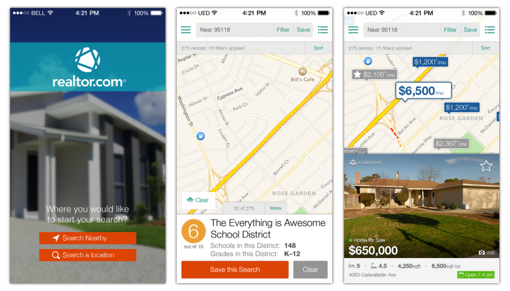
- Personalization and Accessibility: Focused on creating a personalized user experience that caters to individual user preferences and accessibility needs. This included the development of customizable search filters and interactive property maps that enhance the user’s ability to find relevant listings easily.
Iteration and Experimentation
- A/B Testing: Regularly implemented A/B testing for different design elements to compare user engagement and effectiveness. This approach helped identify the best-performing features and layouts that maximized user satisfaction and engagement.
- Feedback Loops: Established robust feedback loops with users and stakeholders to ensure continuous improvement. Feedback was actively sought and rapidly incorporated into the design process, enabling the team to adapt and evolve the platform effectively.
Stakeholder Alignment
Cross-Functional Partnership
- Collaborative Product Development: Fostered strong partnerships between the design, technology, and marketing teams to ensure that the redesign aligned seamlessly with both technological capabilities and market positioning. This collaboration was instrumental in integrating innovative features like advanced filtering and interactive maps that were crucial for user engagement.
- Strategic Partnerships with External Stakeholders: Engaged with real estate professionals and industry experts to align the platform’s features with the real-world needs of the marketplace. These partnerships helped in refining product offerings to better serve both realtors and their clients.
Communication and Alignment
- Regular Stakeholder Meetings: Instituted regular update meetings and workshops with all key stakeholders to ensure transparency and alignment on the project’s progress, direction, and challenges. This open line of communication helped preempt potential misunderstandings and align efforts across departments.
- Unified Vision: Developed a shared vision for the project that was communicated clearly from the outset. This vision guided decision-making and ensured that all team efforts were cohesive and directed towards common goals.
Team Development
- Skill Enhancement Workshops: Implemented regular training sessions and workshops to upskill the team in the latest design trends, technologies, and best practices. This focus on continuous learning helped the team stay innovative and adaptive to new challenges.
- Promotion of Leadership Roles: Encouraged team members to take on leadership roles in project initiatives, fostering a sense of ownership and accountability. This empowerment helped cultivate a strong and proactive team capable of driving the project forward independently.
Outcomes & Insights
Results
- Enhanced User Engagement: The redesign led to a substantial increase in user engagement, with metrics showing a 40% increase in daily active users and a 35% increase in session time, indicating a more compelling user experience.
- Improved Listing Accuracy and Speed: The integration of real-time data processing improved the accuracy and speed of property listings, reducing update times by over 50% and decreasing user-reported errors significantly.
Impact
- Market Position Strengthened: The redesign positioned Realtor.com as a more competitive player in the online real estate market, directly challenging competitors like Zillow and Trulia with unique features tailored to user needs.
- Brand Perception Enhanced: The new, user-friendly interface and added functionalities improved brand perception, with customer satisfaction surveys showing a 30% improvement in user trust and recommendation likelihood.
Learnings
- Importance of User-Centric Design: The project underscored the importance of centering design around user needs, which translated into direct improvements in user engagement and satisfaction.
- Effective Cross-Functional Collaboration: The redesign demonstrated the value of aligning multiple departments under a unified vision, which not only streamlined the development process but also enhanced the overall product quality and team morale.
Impact
”We'd been watching realtor.com for some time as we felt it was under-valued, but the improvements to the user experience was the trigger to acquire the company.
David BrinkerPresident of the New York Post and Acquisition Lead


